Cheeserland has been going through some core changes these days on the way it looks!
i changed blog layout again because the previous one still has plenty of problem and is loading too slow.
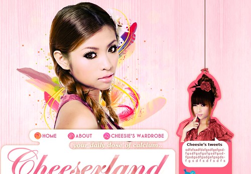
Designed by Blushberry!
.
.
Incidentally, Dutch lady also have a fresh new look for their products! They have made their logo simpler and more recognizable:
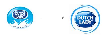
It’s from Ringo to Ring to Rin, (eventually it might be just R), see, simple and easy!
Their packaging is improved too!
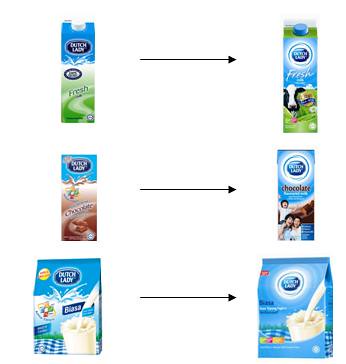
Looks so much more attractive!
My daily breakfast:

I love full cream milk. That extra little calories is totally worth it. Just do a few more sets of Wii Super Hula Hoop and it is bound to cancel it out.
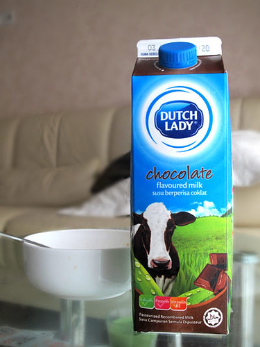
Chocolate milk nom nom nom.
The packaging is more aesthetically pleasing now, but the taste and quality of Dutch Lady’s milk remain exactly the same as i have always loved it!
Just like cheeserland.com (cheh)! Different look, but as dairy as ever just like the way you like it (cheh). Ok i need to stop being so buay paiseh.
Continue to get your daily dose of calcium here!



omg thank you god you changed your layout! previous one was so ugly!!!
haha glad u like it!
i love your rss icon so much 😯
test
hahah yay comment working liao!
well, feel free to steal it. ^^
no i m going to create a better looking 1 👿 👿
XD
yalo yalo.. tht day i went to shop and looked for the Old dutch lady pacaking, cudnt find it.. then i saw this one.. like pelik oni.. then after reading this, oni i figured out they rebranded. LOL.
hahaha u also liek dutch lady ah 😈
Wow!!! I like your layout A LOT!!!!
Looks stunning! 😈
I’m just asking, did you pay blushberry for it? :blush:
nope but her charges are really really reasonable. 🙂
Haha~ But I’m too broke for a reasonable price. >_<"""
love it love it love it love it! it’s very YOU!!! very like the tweet pic of you~~! 😀
nice to meet u that day!!!!
OMG i wuff miruku n cheesu^^ neway saw u in my tomodacheese site^^
http://www.dannyfoo.com/blog/my-life/celcom-xpax-blackberry-party/
u look great^^
hahhaha damn funny you!
Oh wooowwww… I’m in love with this skin too… Pretty… Pink is Good!! ^_^
LOVELY!!!
ya pinks best 😈
your new blogskin owns!!
and i just found out the banner changes too wtf
very chun. 😈
the one before the previous one got change also ma.
wow nice! this layout and banner is much better! very pretty! very cheesie! very Rin! 😆 happy~
hahahah why u happy pula
my screen is not big enough for your new layout.. 🙁
but nice tho.. 😉
time to change, tom. 🙄 ->
LAYOUT BEST!
yay woots
omg!!!! should of done earlier. u could of won the nuffnang blog design award!
haha cannot la. strong rival 😛
i love ur new layout!! but one of the “feathers” near ur chest looks rather phallic. sorry 🙁 nothing against them, just saying.
lol u din say also i din realized. looks more liek french loaf to me 😛
love your new layout + dutch lady 😈
thank you!!!
Better layout leh~ But the comment word abit big =_=”
But overall, very pinky !! Stylish!
thanks for feedback! will do something bout it 🙂
absolutely beautiful blog theme!
😀 😀 😀
my prawn fishing partner did it!
no need so obvious oneeeeeeeeeeeeee :@
Nice design, but wrong on so many fronts. Any web designer / developer worth their salt should have addresses these issues.
1. Banner images are too heavy, over 400k each. These images are bigger in file size than any photo you’ve posted on the site. Very bad optimisation from your designers.
2. The header image pushes all content below the fold of the page. On lower screen monitors, we don’t see any content at all on the initial load, just your face.
3. Your banner images are in PNG format, not properly supported by older version of IE.
4. If you look at your page source, you have so many lines of Javascript before a search engine’s spider gets to your actual content.
5. Heavy page weight.
I have some more feedback, it’s quite damning, not sure whether I should post them here. Blushberry fail.
thanks for feedback jon. already told haze bout it!
!!!!!!!!!!!!!!!!!!!!!!!1111
this layout is soooo pretty i almost spill my soya bean!!!!!
😈 😈 😈 😈
lolol
i love your this layout!!!! hehehhhe
eh we’re gonna be roomies. 😀
you should also mentioned how “ad” focused this blog has become. No 2 is absolutely correct. I think she did it just to pimp out herself.
I commented in (http://cheeserland.com/2009/10/haro-world/) before and i’ll comment here again. I think ever since she started her cheesie roll and then became a contestant on Malaysian Dreamgirl, it is pretty much commercials/ads post since then. Not to mentioned her “store” too.
While earning money from advertisements is perfect alright, there is a thing called doing things in moderation and you are gonna lose your readership if you continue down this path.
Why don’t you sit down then. 🙂
If you cannot stand, why don’t just STFU and GTFO?
Erm..her ‘store’ as you call it has been around since the earlier days of Cheesrerland so I don’t see the big deal there and she used to sell a lot more and a lot more frequently.
Still I don’t see what the big problem is, she chooses what she wants to do and there’s no need to make two comments on the same thing. If you really are a true reader why use a name like cannot stand btw?
👿
LOVEEEEEEEEE your new layout!!!111
yay 😀
I’m in “Aussie” again LOLL
is liddat oneeee
😈 Like!
yays!
😈 omg, i love your new blog layout! *droolssssss.
yay! same karer as yours! well, almost 🙂
pink blogs are best 😈
yesh! pink blogs are the best.
super pretty layout! loving it 😈
😀
don’t know from when onwards, you blog has become my MUST VISIT everyday. ^^
omg awwwwwwww i started reading yours awhile ago also. 🙂
I am very glad that you dropped by my blog. 😉
nice layout…
🙂 thank you
hello cheesie! 🙂 nice layout man wtffff.. my blog layout cannot make it.
i wonder how to get all this nice layout. someone can customize it for me but charging very expensive -_-
nice to see you that day!!! haha you also changed clothes 😛
I like this layout..but I think your Tweet picture is nicer as a header than the current one as it looks more ‘you’. 😀 I know its photoshopped and all but the header pic doesnt really look like you. But its wayyy better than the previous one.
One more thing..the banner’s a bit big cos I cant see any contents til I scroll down.
p/s: I love full cream milk too! 😈
haha u mean on my twitter page is it?
oh what resolution are u using?
hey really cool layout! i love the pinkness of your blog! it’s very girly and subtle 😈
but hor, i think ur banner u over-photoshopped it. you look very fake (in the banner) and i almost couldn’t recognize you (no offense la, just an honest opinion). the eyes and the lips are very scary, too. like vampire liddat. i hope you can put a more natural photo of u as the banner, then ur blogskin will confirm be chun! mou dak denG!
haha! can consider! still tweaking it 🙂
pink is back finally~~ horray~~ 👿
yay!!!!!! pink is best!
i agree with smeech, use a more natural photo, thankyou. 😀
thanks for input! 🙂
I really like your new layout! The banner pictures are over-photoshopped though.
supposed to have this exaggerated look one. like anime. 😀
OHH I like anime. That makes it cool and pretty then 😛
hmmm….dutch lady ah….must try….i always drink the HL milk one…their milk taste nice ler…hehehe
but i dont like HL, taste too vanilla.
wow i like the nice template. very nice sexy pic of u 😉 !
haha no cleavage also
cheesieee
ur photo on the layout doesnt look like u 😳
its nice but – doesnt look like u
ehh how come it change ? it was the one frontal look, now the side pose
ya cuz on rotation. 🙂
Thumbs up for the new blog layout!! 😈
😀 thanksss
It looks alright I guess but you will do well if you change your header pic. Please shopped it if you really want to go with it, your two tone hair looks skanky/cheap. I am sure that can be fixed easily with photoshop.
thanks for input! will look into it ^^
A little more to 2k feeds and I’ll belanja you all the Crab you want 😈
yayss
have to agree, this layout is a lot classier! 😈
yay happy to hear that
@cannot stand hey, with all the blogs out there, why do you think she gets all the ads? blogging is her career fyi, everyone has to earn a living, she’s happy with what she’s doing and not harming anyone, why not you be happy for her and share her joy like other people. 😀
very hard one.
hi Ring,
nice tweet pic on d top right.
i still prefer the old logo for DL. i dunno why. maybe not used to new one. lol. but the inclusion of images like cow or family are eye-catchy. Thumbs up! 🙂
messilegend
ya ya i liek cows. they are yummy lol!!!
Thank you everyone for feedback! Will look into it. 🙂
😈
uhhooh. i LOVE your layout!! but it’s that damnnn speechbubble for twitter again. can’t people be more original? RIN, i <3 you, just not feelin d speechbubble.
well if i remove the upwards pointed part, it is not speech bubble anymore isnt it.
nice design
i want belgian chocolate!!!!!!!!!!!!!!!
I prefer full cream milk too…but mummy always buy skim milk for me! 😐
same here. fullcream tastes better, more fat. lol 😀
this new look is nicer.
i like chocolate flavoured milk. i normally buy the low fat milk
This new design looks totally nicer!
Well done!
And.. I love milk too!
i think ur picture has too much make up, too photoshopped and just looks a bit scary. but the layout is nice. 😈
Probably tis comes a little too late.. but, i just got to say.. I like ur new layout! Looks really nice.. 🙂
I like your layout, especially the banner. You look so ‘hiong’ in the photo, in a good way, but a bit not so you, but still very gorgeous! hehe. =D
Ooo!! I love this layout way X100000 more than the orchid one! *LURVES* 😀